Grid
Available since 1.0.0
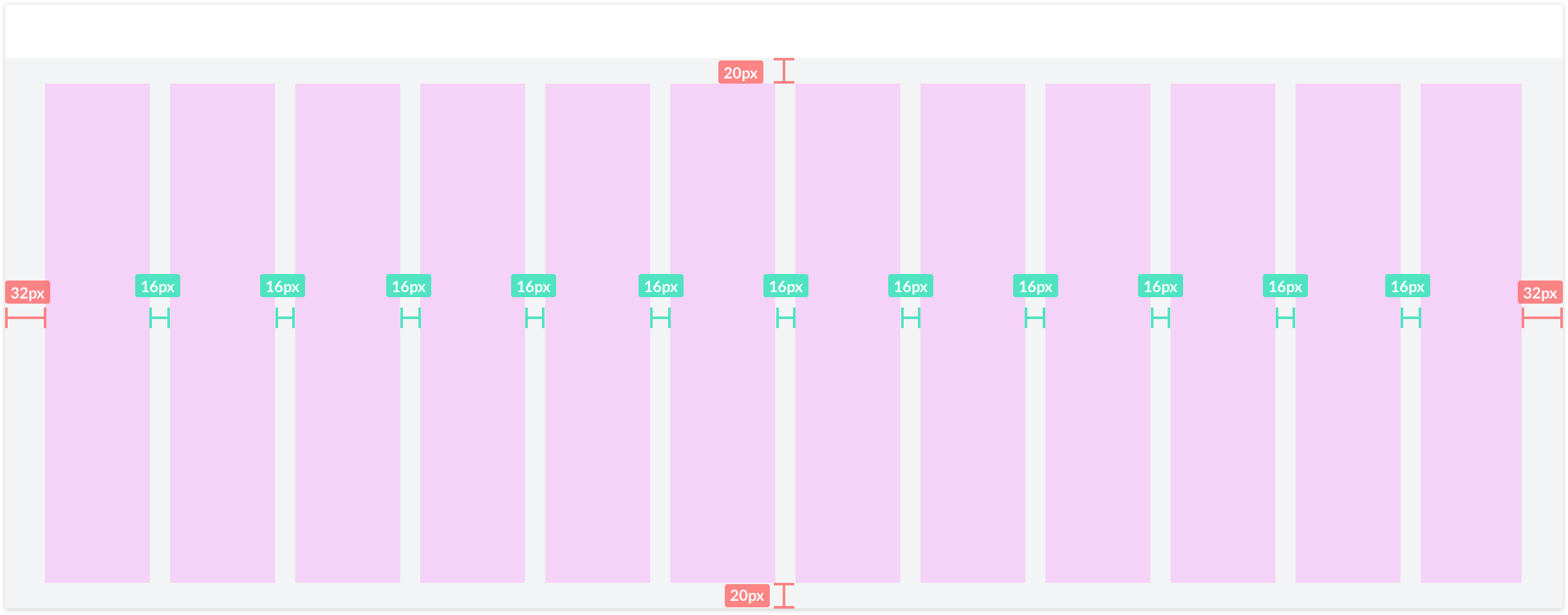
SAP Fundamentals uses responsive grid system with a 12-column flow layout. It is used to create flexible layouts for various screen sizes and device types.
Tablet example grid

Breakpoints
Available since 1.0.0 Last updated 1.4.0
When considering responsive views we follow a mobile-first approach where screens are built for small screens and adapted for larger screens. This means that S is always the default and we modify for M and above.
| Size | Target Devices | Breakpoints | Margin | Gutter |
|---|---|---|---|---|
| S | Portrait Phone | <600px | 8px | 8px |
| M | Landscape Phone, Portrait Tablet | 600-1023px | 16px | 16px |
| L | Landscape Tablet, Small Laptops | 1024-1439px | 32px | 16px |
| XL | Pro Laptops, Desktop | 1440-1919px | 32px | 20px |
| XXL | Pro Displays | 1920px | 48px | 20px |